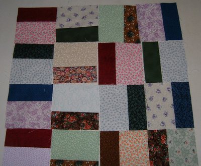
Another Try
I think the simplier the better to show off the great fabrics. I like the second one. What do you think? second pic not laid out carfully enough. Sorry but I think you can see what I mean.


Just thoughts about my life and the progress of my quilting, with lots of pictures.
4 comments:
To be perfectly honest, I much prefer the layout you posted on Tuesday. Lots of movement there. I find these two new arrangements very static and much less interesing. If it were me I'd go back to Tuesday's layout. Beautiful fabrics!
If you're looking for an opinion, I too like hte second picture today best... I like the calm rythmn of the stacked blocks, yet find it interesting enough as the seams don't all match up so my eye "travels" around.
BUT honestly, do whatever inspires you when you get to sewing them together. It'll be the right choice :-)
I think I like the pattern you posted on Tuesday the best.
Yup, both of the pics in Thursdays posting look better to me. Maybe the dark pieces coming together to make that "crank" is just too much dark focus. Hope you are staying cool, and that the storm didn't do you any damage. Hugs, Finn
Post a Comment